Custom Styles for Form Inputs with Example Code
Form elements like Radio Buttons and Checkboxes get their basic styles from the browser. These input items follow standardized rules for collecting form answers. For example, Radio Buttons only allow one choice per group and Checkboxes allow for checking and unchecking more than one. Sometimes these standard input items benefit from custom styles to make them more interesting or user friendly.
Built-in Custom Styles
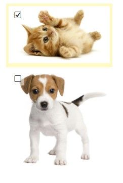
For example, our Image List item lets form owners use images for choices. By default the item allows for multiple selections and shows Checkboxes in the corners. Setting the max setting to 1 changes it to Radio Buttons.
Those who want to go beyond images and apply styling for all form elements can do so. Form owners who want to enhance the custom styles for input items use the CSS settings on the Style -> Advanced page to change their appearance.
Applying Custom Styles
Try any of the examples by copying and pasting the code to the bottom of the form’s Style -> Advanced page before the </style> tag at the bottom.
Customize the colors, sizes, corner rounding, etc. by changing the CSS settings in the provided code.
Examples of Custom Radio Buttons and Checkboxes
.q .choices input + label {
  width: 100px;
  padding: 10px;
  background-color: #efefef;
  border: 1px solid #cccccc;
  border-radius: 5px;
  text-align: center;
}
.q .choices input + label::before {
  display: none !important;
}
.q .choices input:checked + label {
  background-color: #ffff00;
}
Use different styles for Radio Buttons by adding a type to the input. For example, to only target Radio Buttons add the [type] after each input:
.q .choices input[type="radio"] + label {
To only target Checkbox items:
.q .choices input[type="checkbox"] + label {