Mobile Code Examples for Sizing Images and Responsive HTML

Formsite online forms creates web forms that visitors complete through their browsers. The size of the device used can make the display vary and that’s called responsive design. The elements on the page “respond” to the size available. Using the mobile code examples in this article can help make forms, Success Pages, and Notification emails responsive.
Importance of Responsive Design
Responsive means that larger screens show larger versions of the page elements and smaller screens show smaller versions. Often, scaling the elements would make them too small so responsive design lets form owners create pages that look good on all screen sizes.
Responsive design aims to create websites that adapt to various screen sizes. The goal is for content to remain easily accessible and visually appealing on any size screen. This adaptability is especially important for images.
Mobile Code Examples for Images
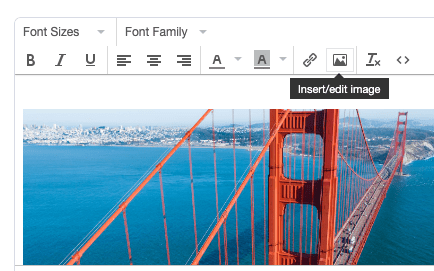
One way to ensure that images scale correctly across devices is by using inline CSS for flexible sizing. Using the Description Text item, click the image button to add an image to the form. The default code appears as:
<div><img src="[image URL]" alt="" width="309" height="385" /></div>
The height and width settings tell the browser to show that image at that specific size regardless of the screen size. To make it appear correctly on smaller screens, change the code to:
<div><img src="[image URL]" alt="" style=”max-width:100%;height:auto;” /></div>
This style setting tells the browser to display the image as wide as possible in the container where it’s located. The height setting says to make it as tall as it needs to be to keep its normal aspect ratio. This method allows images to resize according to the screen size without losing quality or breaking the layout.
Mobile Code Examples for HTML
Success Pages, Custom Code items, and Notification emails can contain custom HTML that also needs to adapt to screen sizes. Creating a responsive HTML structure is vital for readability and usability across devices.
Consider when using a table element with wide desktop screens vs. narrow smartphone screens. Simply making the table fit the narrow screen would not provide for an acceptable user experience. Using the inline style settings to display tables with responsive scrollbars:
<div style="overflow-x:auto;">
  <table>
  ...
  </table>
</div>
Try resizing this window to see how it works.
| First Name | Last Name | Points | Points | Points | Points | Points | Points | Points | Points | Points | Points |
|---|---|---|---|---|---|---|---|---|---|---|---|
| Jill | Smith | 50 | 50 | 50 | 50 | 50 | 50 | 50 | 50 | 50 | 50 |
| Eve | Jackson | 94 | 94 | 94 | 94 | 94 | 94 | 94 | 94 | 94 | 94 |
| Adam | Johnson | 67 | 67 | 67 | 67 | 67 | 67 | 67 | 67 | 67 | 67 |