Mobile Responsive Online Forms that Work Everywhere

Many form owners ask about using Formsite with mobile devices for building and completing forms. Formsite is working on optimizing the mobile form editor to make building and editing online forms easier for mobile users. Our forms work with mobile and desktop browsers through ‘responsive’ code. Mobile responsive pages means the styles display based on the size of the browser window.
Responsive pages respond to the display size, which typically indicates the kind of device used. For example, desktop computers have wide monitors so the page viewed has space on the left and right. Since desktop monitors are larger, font sizes can be smaller and scroll bars let users view longer content at the top and bottom.
Mobile Responsive Forms
Viewing online forms with mobile devices typically means a smaller display. Some tablets have large screens and larger phone screens are currently popular, but in general mobile devices are smaller. The ‘responsive’ styles use media queries to see the size of the screen used, then displays the content based on that value.
Small screens that suggest a mobile device use styles to increase the font size and item spacing to accommodate touch navigation. Some browsers detect form input fields and will ‘zoom’ the display a little to further enhance the experience.
Customizing Styles for Mobile
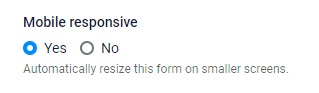
Formsite forms contain a setting on the Style -> Advanced page that lets form owners disable the responsive styles if needed. The setting defaults to the active state so all new forms are responsive by default.
To change the mobile styles, we use media queries which define breakpoints and new styles for each screen size. For more information on working with media queries, see this page or search online for “media queries”.
Watch Out For Small Embedding
Since the size of the display window determines the style, embedding forms into small containers can trigger them. For example, if the area on your site is narrower than the breakpoint for the mobile devices, the browser uses the code for smaller screens. That may result in an unexpected display or one that appears different from what’s shown in the editor.
The solution would be to either set the Mobile Responsive setting to No, or add custom styles to the media queries.