Multi-select Items: When to Use Radio Buttons, Dropdowns, & Checkboxes
Form building can be tricky the first few times until you get used to the different items and their ideal uses. Text input fields are typically easy to understand, but multi-select items used to select pre-filled choices are more complex. These items include:
- Radio Buttons
- Dropdowns
- Checkboxes
When should you use each one? Are there guidelines to follow?
Multi-select items overview
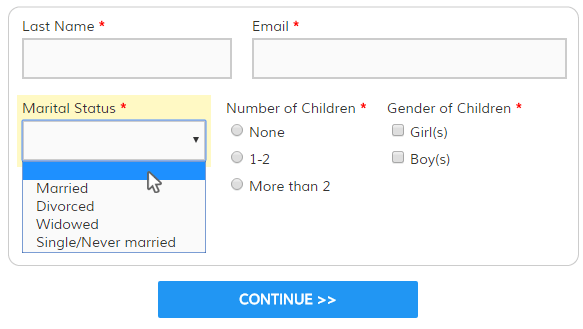
Radio Buttons: Used when a single answer is required and there are between 2 and around 10 choices. Radio buttons cannot be deselected, although it’s easy to add options for ‘all of the above’ or ‘none’. Often you’ll see an option for ‘other’ along with a text box, too.
Dropdowns: Used when a single answer is desired and there are between 10 and 20 choices. More than around 20 choices makes dropdown lists a chore to work with. Fewer than 10 choices hides the available options and may be better served with a Radio Button group.
Check out an example of dropdowns gone bad and some hilarious alternatives.
Checkboxes: Used when multiple answers are supported (or none) and also is commonly used with an ‘other’ selection with a text box. Not typically used with ‘all’ or ‘none’, though.
Choosing the right item
The best item for your use will depend on a few questions:
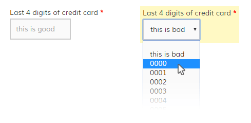
1. Is it easier to type or select the answer?
The phone number question in the dropdowns gone bad link above is an example of when a text box would make the most sense. For questions where visitors are used to typing their answers, use a text box.
2. Is there more than one answer?
When there is more than one answer or you want to give the ability to not answer, choose the checkbox item. For example, if your question asks to select all that apply, you would use a checkbox item to enable all, some, or none.
3. How many choices are available?
If the question requires a single answer to be chosen, the radio button or dropdown item is used. Choosing between these two items is a matter of preference in most cases, but here are some guidelines:
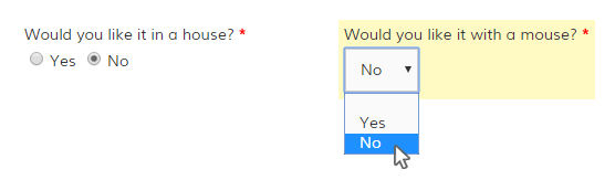
- 2 choices is typically handled using radio buttons, as in Yes/No or Male/Female questions. Using a dropdown in this case would make answering the questions tedious for the visitor because the choices are unnecessarily hidden.
- Fewer than around 10 choices is usually best handled with a radio button group because the choices are easily seen and reviewed. More than 10 choices are difficult to take in, which is where the dropdown list comes in handy.
- Greater than around 10—but less than around 20—is where the dropdown list shines because the answers are only visible when the visitor clicks on the item so the question is less-intimidating. The visitor can scroll through the list and review each choice until the best one is chosen.
- Over 20 choices, however, makes for a long and frustrating experience when the visitor needs to spend excessive time and energy navigating the giant list of options. In this case, multi-select items are difficult and a text field is usually a better option.
Exceptions to the rule
There are always exceptions and they need to be addressed as they appear. For example, common among multi-select items is the State selector in an address block. Since there are way more than 20 states the suggestion is to consider a text box, but in this specific case the state dropdown is common and doesn’t offer a difficult choice. It’s also more problematic if it’s inaccurate or mistyped, so the preferred item is a dropdown.
You may decide that consistency is more important than the rules, so be sure to evaluate your own specific needs before applying these rules. Ultimately, the goal is to provide an efficient and pleasant experience for the visitor.