Optimize Your Forms With These Design Tips
If your form is made to collect leads, orders, or other results, you are always looking to improve the conversion rate. As difficult as it is to get visitors to your form, it makes sense that you want to optimize your form to get as many visitors to actually complete the form.
Increasing conversions is done by making changes to your form then comparing the results to see what works better. Over time, your form will evolve into a high-performing results generator.
What can you change about your form to help it work better? Simple things like layout and some text changes can make all the difference.
Fewer Form Fields
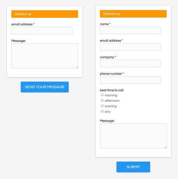
A common tip is to reduce the number of fields, but that advice mostly applies only to contact forms and other lead generation forms. If your registration requires more items or if you are making a longer evaluation form, it may prove difficult to trim the fields too low.
Ask Only for Necessary Information
Instead, our advice is to ask for what’s necessary. For example, do you really need the company name or fax number? Even sensitive information like SSN or date of birth can most likely be collected further along in the cycle.
Improve Messaging & Call to Action
One of the trickiest parts to optimize and designing your form is writing to be clear. Headlines, buttons, and even labels can be hard to decipher for some visitors. Button text is the most commonly suggested area of improvement because studies show that you’ll get more clicks when the button clearly states what will happen. For example, never use the default ‘Submit’. Instead, if your form will register visitors then change it to say ‘Sign Up Now’.

Design tip: Bigger buttons ‘feel’ more important so try to think of a 3-5 word phrase that starts with an action word. Don’t get carried away—keep it short and sweet but relevant and punchy, too.
Along with button text, headlines are a common source of frustration. A great rule of thumb is to remember to start your headlines with a verb and keep them short:
“Sign up for the event”
“Register to Win”
“Send us your information”
Optimize Layout & Position
Test your form with a variety of lengths to see if the conversion rate changes between a 1 or 2 page form and breaking it into several smaller pages. You may find that your customers don’t mind scrolling, or you may end up losing longer messages instead.
 Single column forms have proven to be much easier to complete and more popular among form visitors, so resist the temptation to squeeze items into multiple columns. The most important advice is to group related items together so don’t worry about forms that make visitors scroll. Today’s touch-enabled devices make scrolling a non-issue.
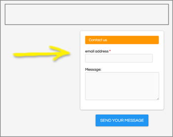
Design tip: If you’re embedding your form on your site, studies have shown that forms in the right column perform better than left column forms. Test yours to see if that’s true.
Final Word
The most important message is to perform your own tests. Knowing what areas to test is almost as important as the results, but nothing can beat your own experiences to optimize your form for maximum performance.