Responsive Forms Setup & Customization
Mobile-friendly web pages are a must-have for giving your site visitors a usable experience and for increasing your visibility with search engines. The most efficient way to display your page and forms correctly on both full-size and mobile displays is to make them responsive. That means they respond to the size of the display and let designers specify styles to apply for different sized displays.

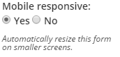 Formsite forms are mobile responsive forms by default. If your form is old or you’re using a copy of an old form and your form does not show the mobile-friendly appearance on a mobile device, your form may have the setting disabled. You can change the Mobile responsive setting by going to the Form Editor -> Style -> Advanced page.
Embedding Responsive Forms
If you are using your form’s embed code to insert it onto another web page, you may encounter times when the form doesn’t behave as you expect. Either the form doesn’t respond when it should or it appears responsive when it shouldn’t. Let’s take each scenario one at a time:
Non-responsive form:
In order for your form to trigger the mobile-friendly code, your host page must contain the viewport meta tag in its head section:
<meta name="viewport" content="width=device-width, initial-scale=1" />
Once you have confirmed that your host page contains the viewport meta tag and that your Mobile responsive setting is enabled on your form’s Style -> Advanced page, your form should trigger the built-in responsive code.
Mobile appearance on full-size display:
Since the code is triggered by the size of the form, there may be times when you want to embed your form into a small element on your page and you do not want the form to be responsive. Those times are examples of when you may want to disable the responsive behavior:
mobileResponsive=false
Note that disabling the mobileResponsive settings will require that your host page apply the mobile styles to the embedding container on the page.
Making changes
We use media queries to trigger the different styles and you can add your own modifications to fully customize the mobile experience. Add the following code to the bottom of the CSS before the closing </style>:
@media (max-width: 480px){
 /* Your custom CSS for small displays goes under this line */
 }
@media (max-width: 649px), (device-width: 768px){
 /* Your custom CSS for medium displays goes under this line */
 }
Click here for more information about using media queries.