Sizing Images for Responsive Forms and Surveys
Forms that are ‘responsive’ means that they automatically resize themselves depending on the size of the window used to view them. If a form displays on a large monitor then it should appear differently than on a smaller device like a smartphone. Sizing images for responsive forms can be tricky so here are some tips and shortcuts.
Methods for Using Images
Images are added to Formsite forms in several ways, most commonly:
- Image item
- Formatted Text item (or text editor for Notifications, Success Pages, etc.)
- Heading item
- Image List item
Formatting images using these methods presents challenges for form owners in some cases. The application of CSS and/or other HTML code helps to optimize how the images appear on forms.
Sizing Images Using CSS
All of the image addition methods allow adding images to the form using the default settings. The only times a form owner needs to customize the images is when a responsive form is needed or when the image display size needs modifying.
Image item
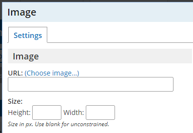 The Image item is a quick way to add images in the Files & Images area or using a web-accessible URL. Adding the item to the form allows for uploading an image right away or selecting a previously-uploaded file.
Sizing the image is done through the settings on the Image item, but does not allow for adding custom code.
If the image needs to have custom code or CSS applied, changing to a Formatted Text item is recommended.
Images in the Formatted Text item and the text editor
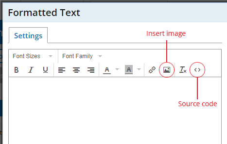 Adding images using the text editor is as easy as clicking the image button and pasting the image’s URL. Sizing the image and making it responsive requires clicking the ‘source code’ button and adding inline CSS.
The default code will appear similar to this:
<img src="https://url" alt="" width="200" height="200" />
To make the image responsive, add code that expands the image to fill the area or its maximum size is reached. For example, if the image width is 550px then viewing larger than that size will display a lower-resolution image, which is not good. The CSS will therefore need to tell the browser to display at 100% unless that’s more than 550px:
<img style="width: 100%; max-width: 550px; height: auto;" src="https://url" alt="alt text">
- Original ‘height’ and ‘width’ properties are deleted when using inline CSS
- The ‘width=100%’ tells the browser to scale the image’s width to fill the space
- The setting ‘max-width:550px’ tells the browser the maximum width to display the image. This value should be the actual width of the image.
- The ‘height:auto’ is important because it tells the browser to keep the proportions the same. If this value is not included then the image most likely appears stretched out of proportion.
Image List and Image List Pricing items
The Image List and Image List Pricing items allow for displaying images in a list as Radio Buttons or Checkboxes. Set the size of the images in Image List items through the image width setting in the item’s settings window. The item will always scale proportionally so you cannot currently customize the height.