Formsite Design Enhancement for New List Navigation
As part of Formsite’s continuous improvement, the latest interface design now appears in all accounts. In addition to a style update, some areas with lists of settings are enhanced with the new List Navigation. The new List navigation style brings a more intuitive and simplified organization for lists of settings. Several pages in Formsite accounts have ways to create multiple settings and display as a list:
New List Navigation Features
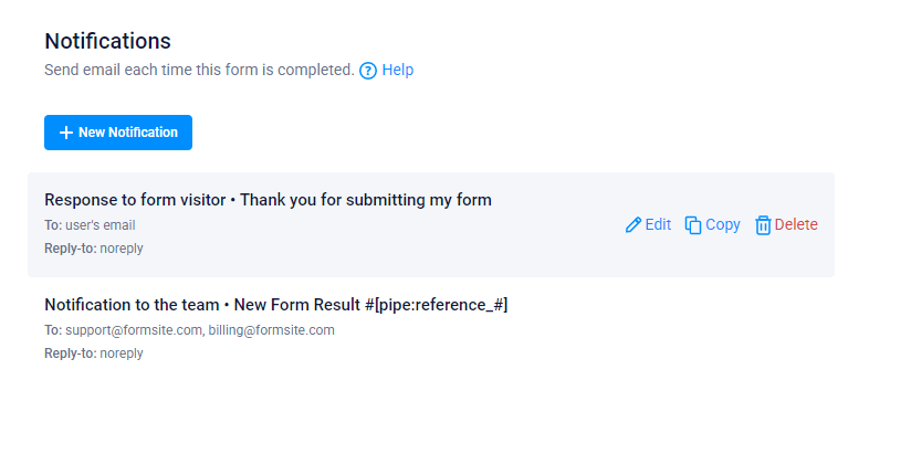
The List navigation style removes unnecessary design elements like separators and borders in favor of more white space. Moving the lists of settings to the middle of the screen helps to establish the most important content.
With the content in the middle of the screen, more information appears for easier recognition. For example, the Notifications now include the subject line and Reply-to address. Having the individual settings as rows in the center area allows for more space for information and easier naming options.
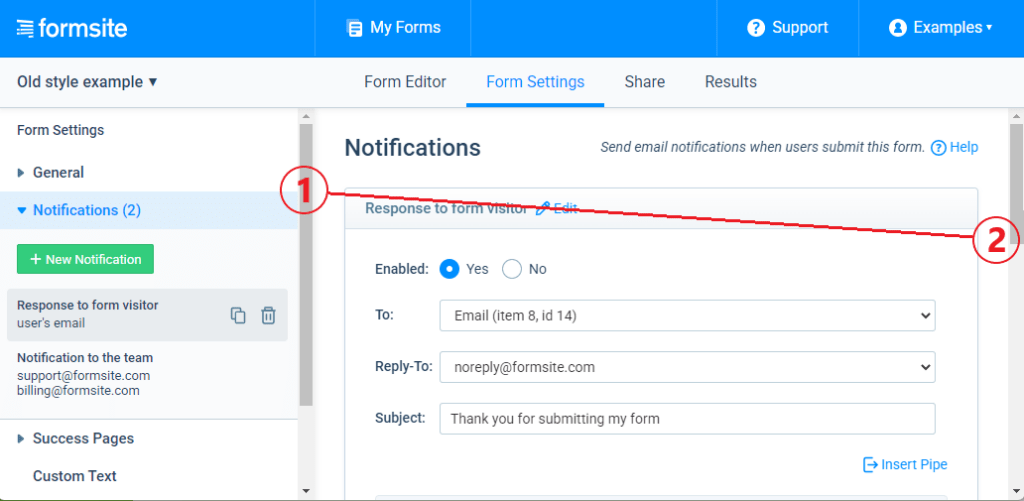
The List navigation update makes adding and editing new settings easier, also. A popular addition is the back arrow in the setting heading that lets users return to the previous page quickly. Making new settings, editing existing ones, and deleting with the new navigation style is clearer.
An example of a problem that needed a solution was the dreaded “double scrollbar”. This situation occurred when a list of settings appeared in a smaller edit area. That and many other design improvements appear in this style update.
If you’re a Formsite customer and feel like contributing your opinion, please send us your feedback by clicking the link in your account.